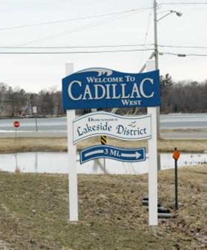
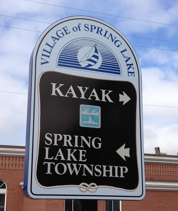
Have you noticed that wayfinding is becoming A Thing? Wayfinding is a planner buzzword that really just means signs to help you find your way around. In the placemaking context, it serves two purposes: it helps establish a community identity, because the signs’ design and graphics establish or contribute to a theme or brand – like the signs pictured below. And, of course, it helps people find a place they’re looking for or maybe discover a place they didn’t know existed.
The signs above all use words to tell you where you are or which way to go. What if you’re not an English-speaker and you're looking for, say, a place to go kayaking? This one helps, kind of… at least you can narrow kayaking down to either right or left.
It’s interesting that the rise in signage has coincided with widespread access to directions by GPS and smartphones. It is almost certainly about establishing a brand or identity for a community as much as providing directions. Even directions can serve a marketing purpose. If you are not familiar with, say, Spring Lake (Ottawa County, near Grand Haven) and didn’t know there was a good place to kayak, the sign above could bring you back there with your boat for another visit.
There is a level of comfort that comes from signage in places where Siri doesn’t reach – like inside museums or malls, out of the way places, or densely developed locations. Some of the small towns here in northern Michigan have shops or restaurants hidden in back of buildings that you would never find without good signage. There was a great Cuban restaurant in Traverse City that I drove past three times because it was set back from the street and had bad signage. (OK, clearly I am not the best at finding things either…)
The best-planned wayfinding isn’t limited to signs. There’s basic wayfinding and branding, and there’s wayfinding that contributes to a place’s identity, its story. Wayfinding that incorporates maps, apps, web sites, video, and sometimes even live human beings to tell a story is really what creates its identity.
Imagine if Spring Lake’s web site had a map (or even a link to a map) showing kayak launch sites, routes, and places of interest along the way? Or an app that did all those things? Or a paper map? Sadly they don’t. A popular destination up north is Leland’s historic Fishtown. The marker gives you some information about its history. The Leland Chamber of Commerce has a nice web site with a few paragraphs about Fishtown and a Yahoo street map that isn’t scaled to show street names. What about a walking tour of Fishtown with audio about its history, or interactives showing Fishtown now and 100 years ago? Maybe some pictures of those primitive oak boats referenced in the historic marker sign? Ummm… nope.
A visit to Fishtown would be a lot richer experience if there was better information available for visitors than just a historic marker. Fishtown is what makes Leland unique and not another tchotchke-filled lakeshore town. It makes Leland a destination and Leland celebrates (or capitalizes, depending on your perspective) this history; it’s Leland’s place, its identity. And like Savannah’s lost Unique Quotient, if Fishtown or Spring Lake or anywhere else just creates a brand, not a story, it’s no more interesting than the sum of its tchotchkes.
HERE is an interesting interview with someone who spent his career designing maps and signage that relies almost exclusively on pictures, not words.
As always, you can subscribe to blog posts by scrolling to the bottom of any page on the web site, www.ordinaryvirtues.com. Thanks for reading!


